HESAV
Rooted in humanism and expertise, HESAV’s new brand identity aims to bring renewed meaning to the healthcare sector in Switzerland
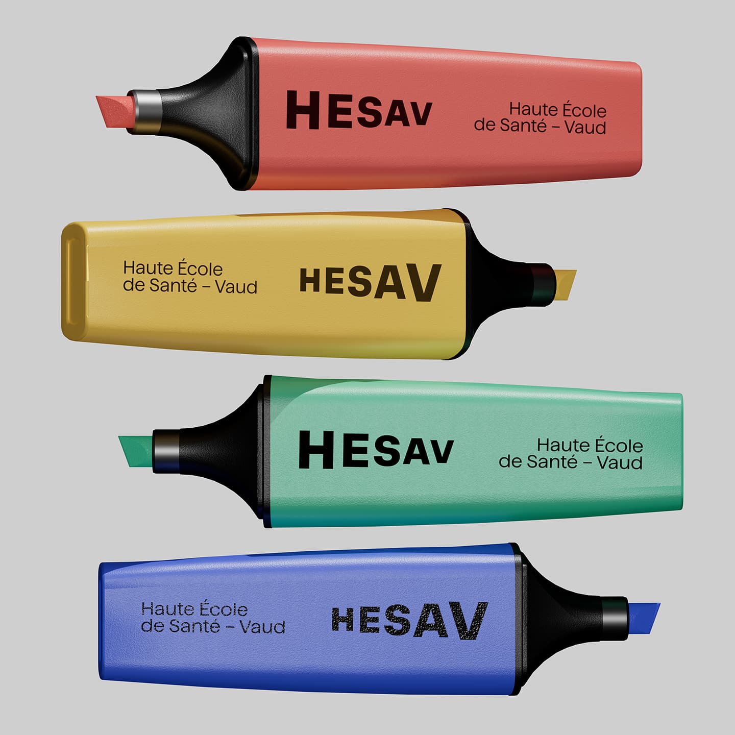
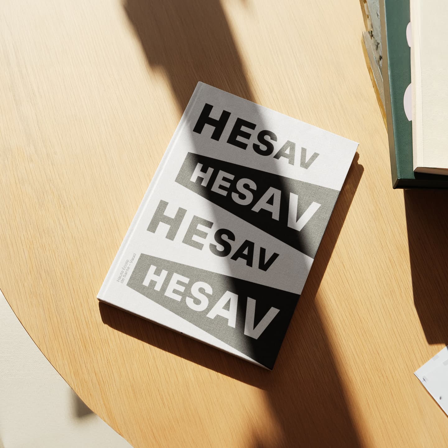
For over 20 years, the Haute École de Santé – Vaud has been training healthcare professionals with dedication and expertise. A new chapter begins with the upcoming move to the Campus Santé. More than just a relocation, it’s a unique opportunity to reaffirm "who we are and where we’re going". The logotype was designed to be in constant motion, a reflection of HESAV’s vitality and the innovative momentum of the future campus that inspired it. At the center of the logo, the letter "S" becomes a true pivot, symbolising both literally and figuratively the institution’s core: Health/Santé. Paired with a warm, multicolored palette, this new identity gives HESAV a resolutely modern image, one that looks confidently toward the future.
Services
- Brand Strategy
- Brand Assets
- Brand Book
- UX Design
- UI Design
- Web Development


