Ackermann
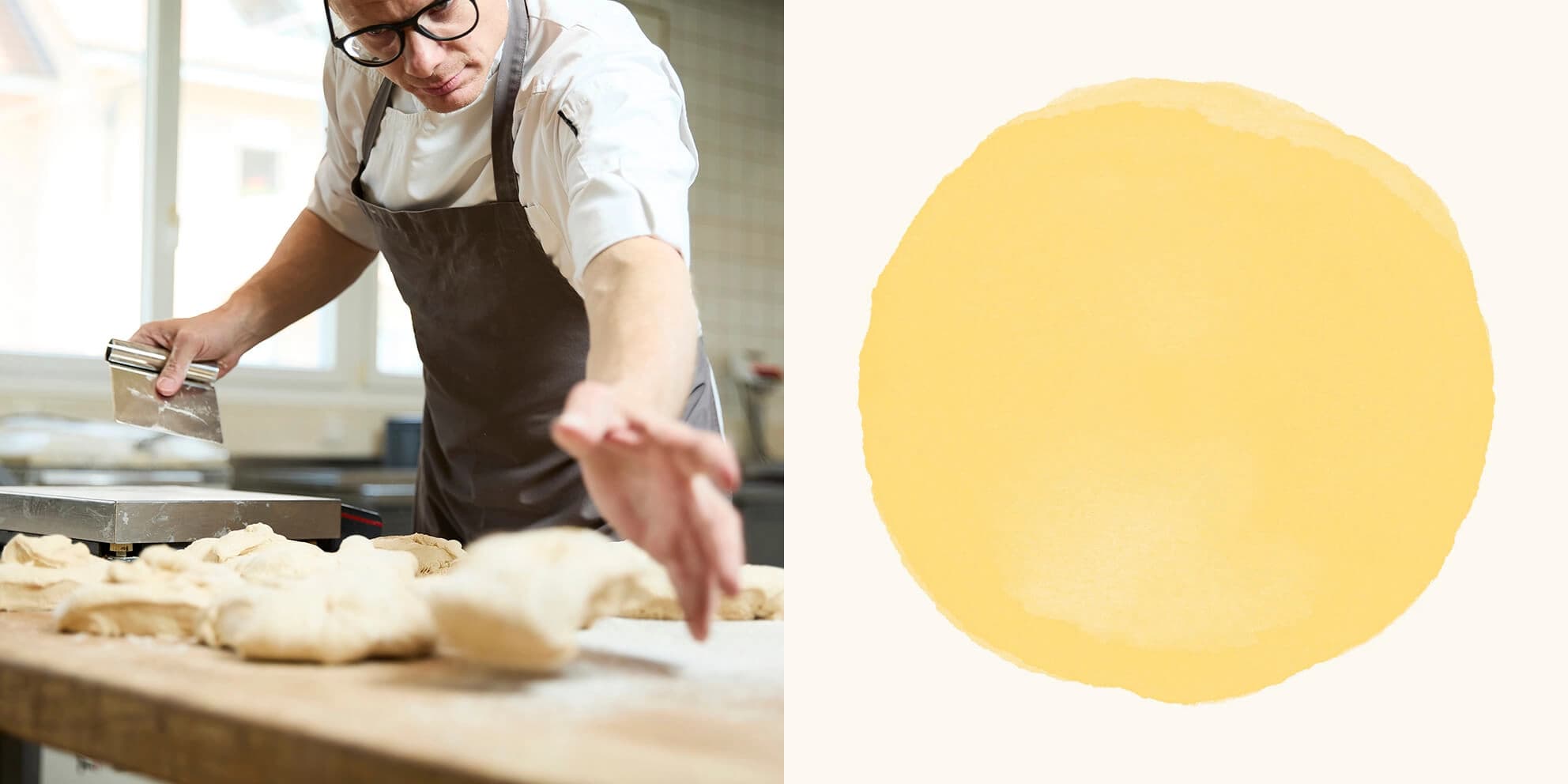
Ackermann’s craft lies in transforming raw material into a true work of art, both visual and flavorful.
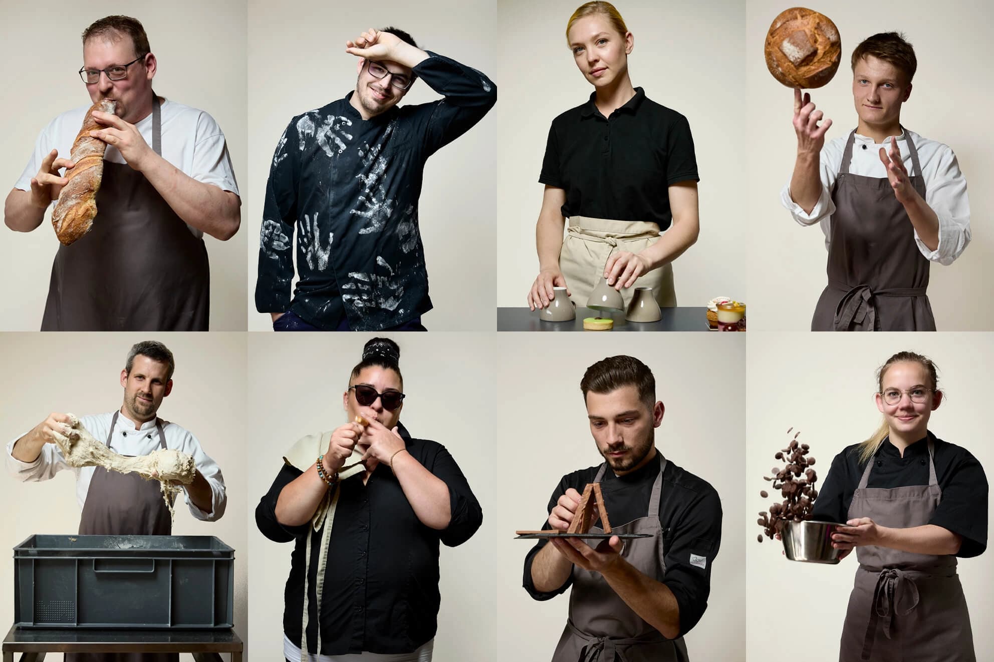
Christophe Ackermann, a Swiss artisan baker, pastry chef, and chocolatier from the Yverdon-les-Bains region, has earned recognition through local and international awards. As the third generation of bakers, he embraced a new chapter after ten years of growth, ready to reinvent his brand.
Services
- Brand Design
- Typo Design
- Brand Assets
- Web Design
- Web Development
- Packaging
- Photography
Our approach
Baking is a timeless art expressed through skilled craftsmanship, the shaping of forms, and the careful handling of ingredients. We highlighted the defining elements that make Ackermann a truly unique bakery and translated them into a visual identity for its future.
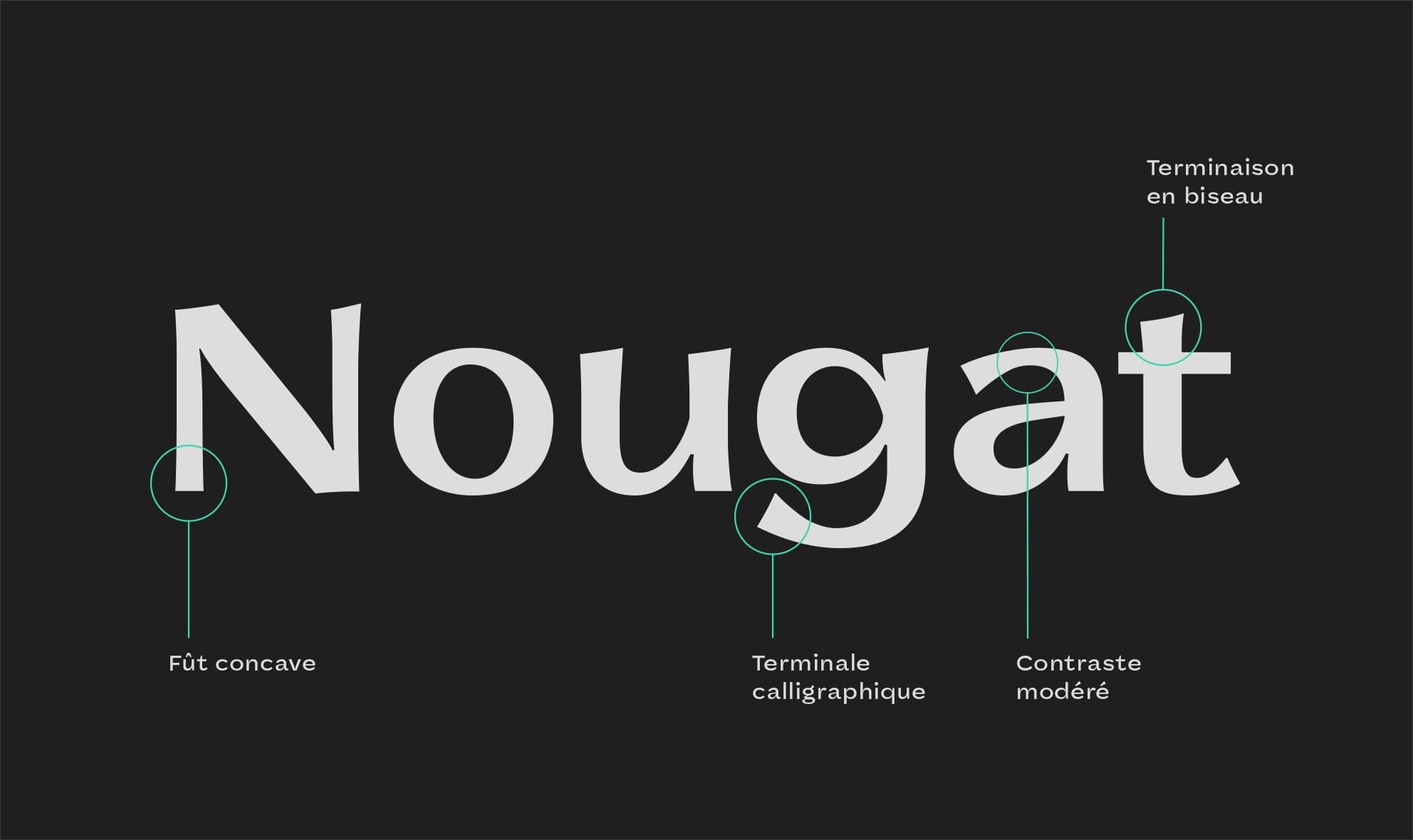
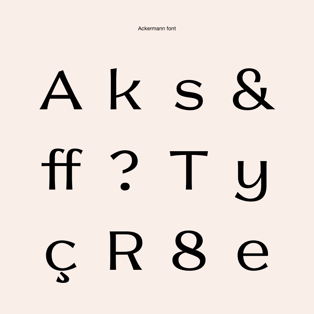
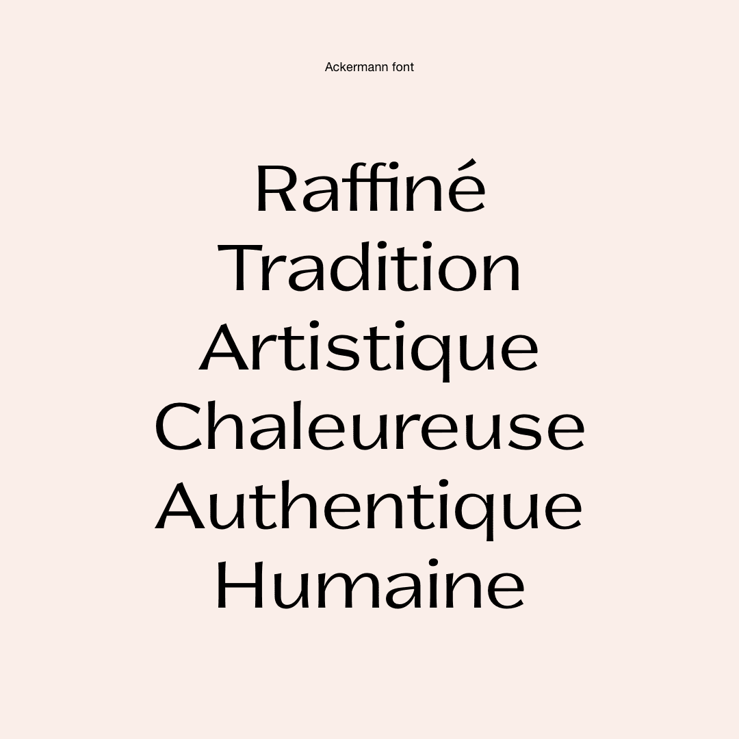
A custom typography
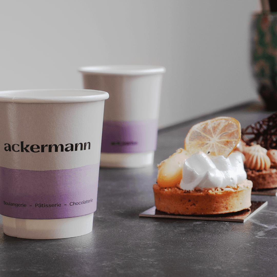
Consistency was a central element. Just as good bread requires local, high-quality ingredients, a strong visual identity requires attention to detail and coherence.
To achieve this, we designed a custom typography that creates a strong connection with the logo’s symbolism and enhances visual richness.
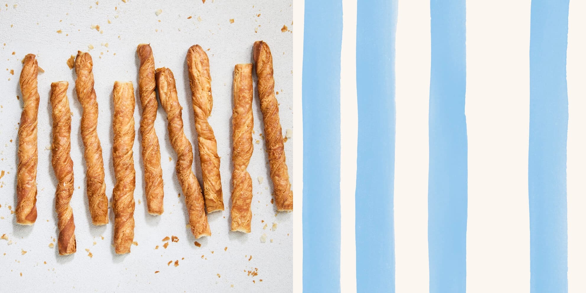
The art of elevating material
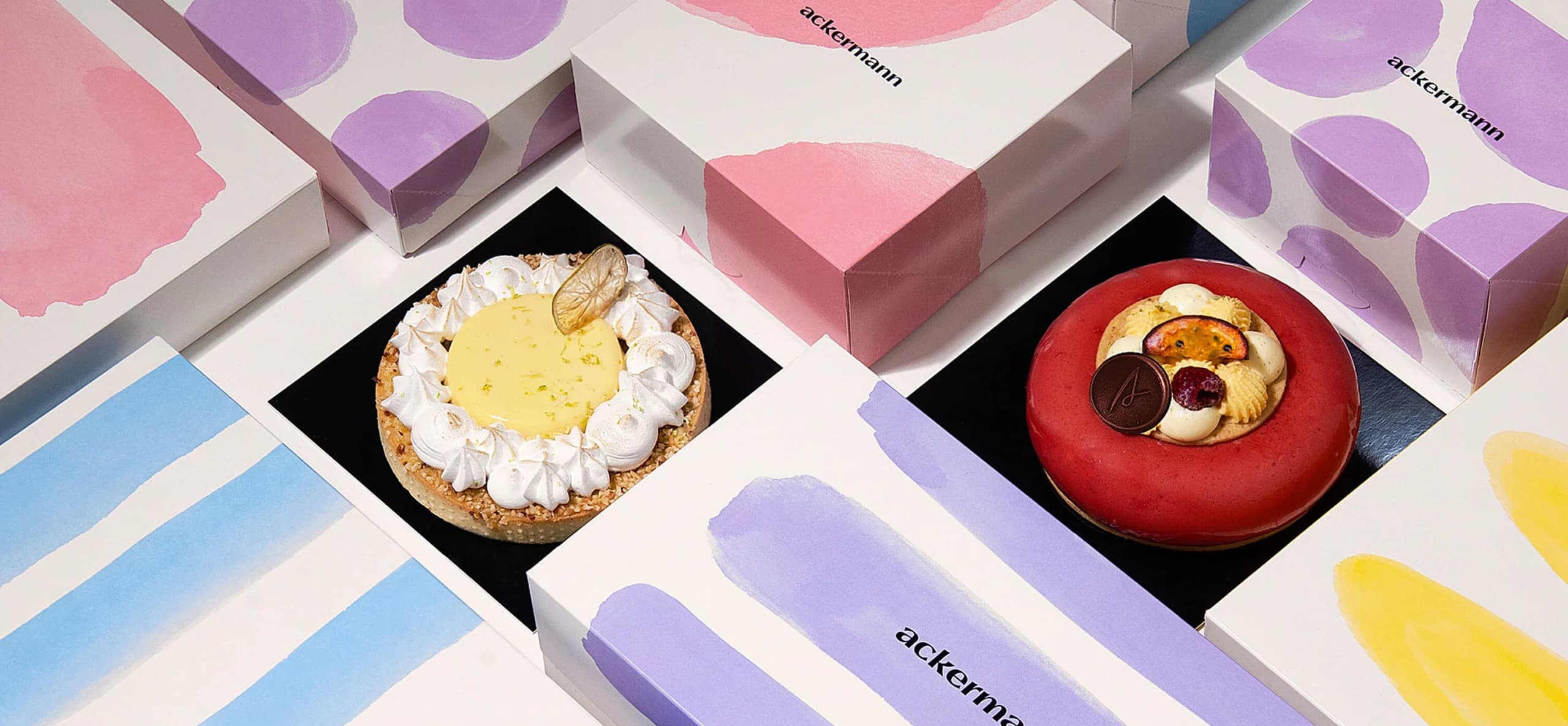
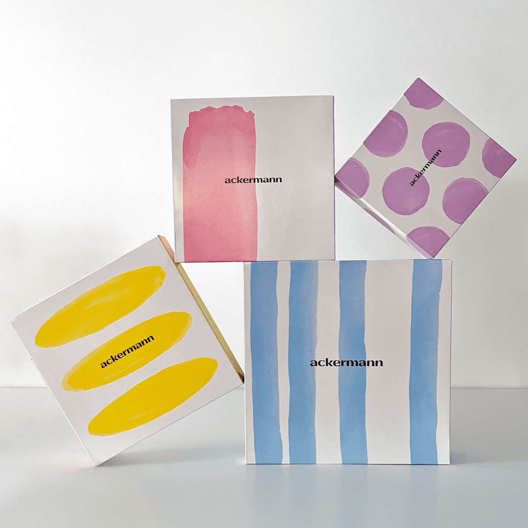
The new brand presents an artistic vision of how the baker’s ingredients are used. Each shape serves as an artistic metaphor for the material.
Flours, chocolates, and dough are no longer mere raw ingredients but become artistic material.
An almost infinite palette
The visual identity draws inspiration from old packaging of traditional products, such as Iberian soaps, which featured a variety of highly creative visuals while maintaining coherence.
Working with you has been an exceptional partnership. You helped me build the foundation for a whole new chapter, driving meaningful strategic change. The outcome is outstanding, and I am truly proud to be on this journey with you.