Freeride World Tour
Translating the unique emotion of the Freeride World Championship into a global multi-site experience. Creating a digital journey as thrilling as a downhill run, giving depth to every competition and uniting a global community around pure adrenaline.
Freeride World Tour, the leading global freeride circuit, brings together professional, junior, challenger, and qualifier competitions on an international scale. The organisation turned to Superhuit to redesign its website with two key goals: clarify the competition structure and boost the visibility of the junior and challenger circuits. All of this within a unified digital approach tailored to a global audience, and robust enough to handle high traffic peaks during the season. At the same time, a new competition management system was rolled out. We developed a custom synchronisation with their API to ensure real-time, seamless integration of race data.
Services
- Brand Strategy
- Brand Architecture
- Brand Design
- UX Design
- UI Design
- Web Development
- API Integration
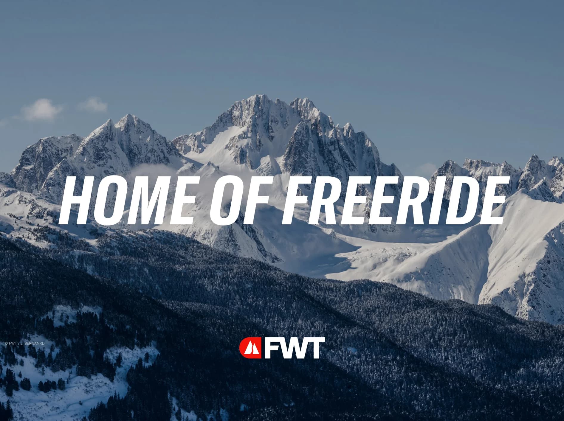
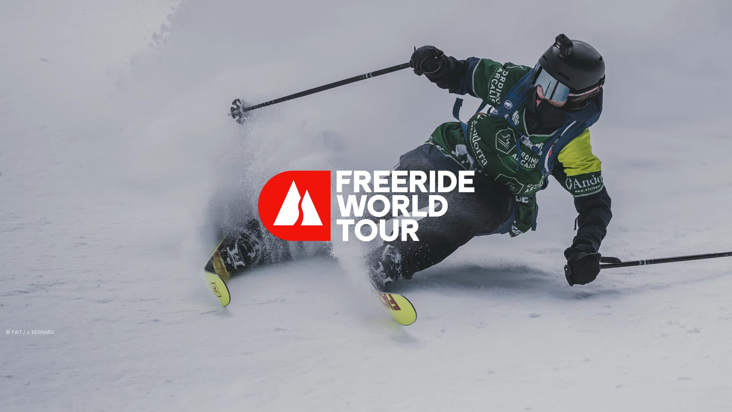
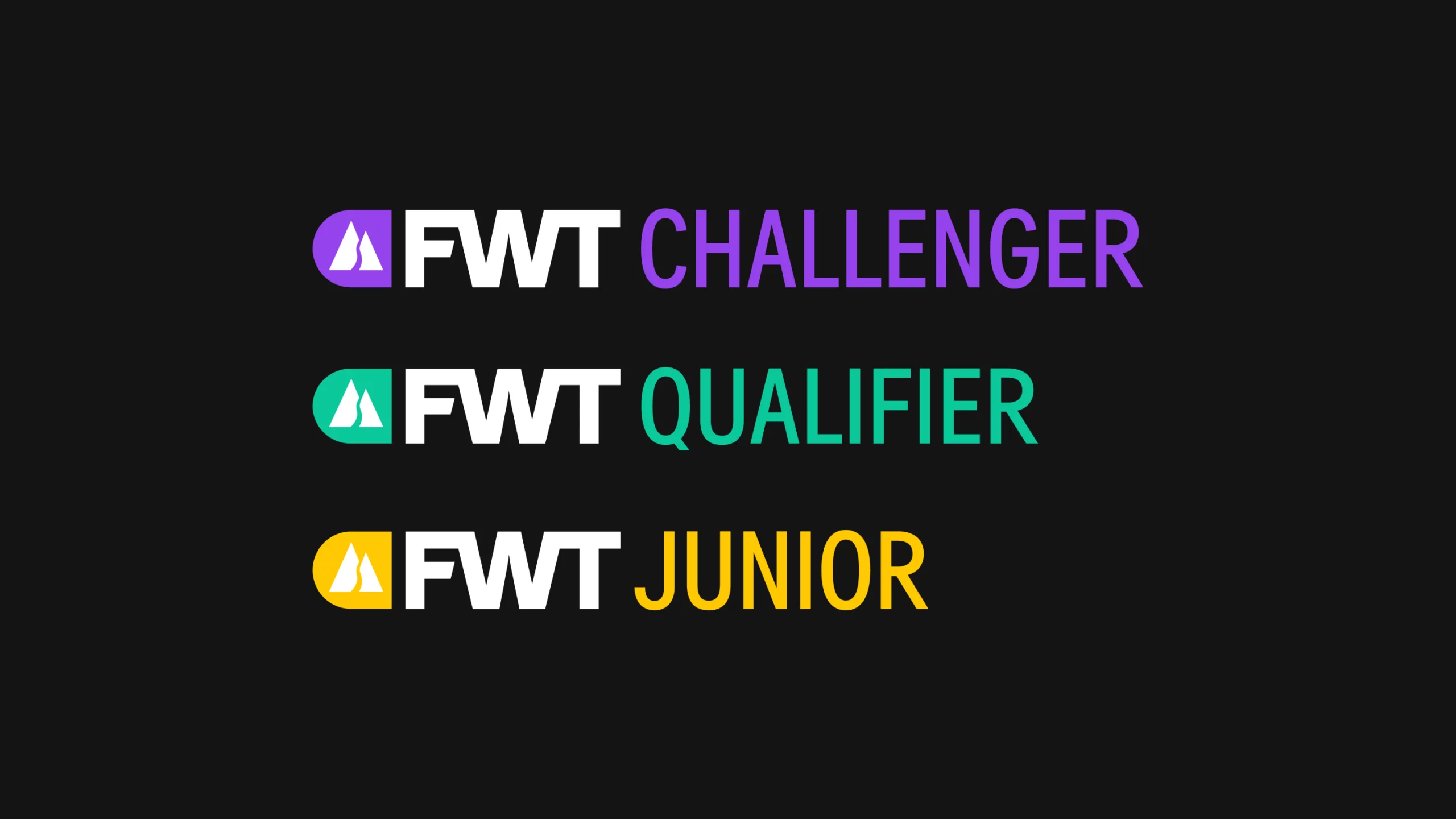
Revealing the DNA of the Freeride World Tour: where boldness meets prestige.Through a series of workshops, we helped clarify FWT’s brand positioning: spectacular, authentic, and the global leader in freeride. This strategic work led to a redefinition of the brand architecture and the creation of a strong new visual identity built to evolve with every new season.
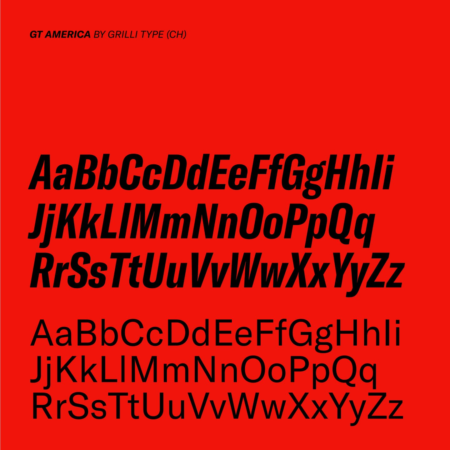
We redesigned the main logo and created a series of new marks to reflect the evolution of the competitions. Inspired by the grandeur of the mountains and the adrenaline of freeride, the visual identity strikes a balance between boldness and restraint. A daring signature that embodies freedom, mastery, and the pursuit of the perfect line.
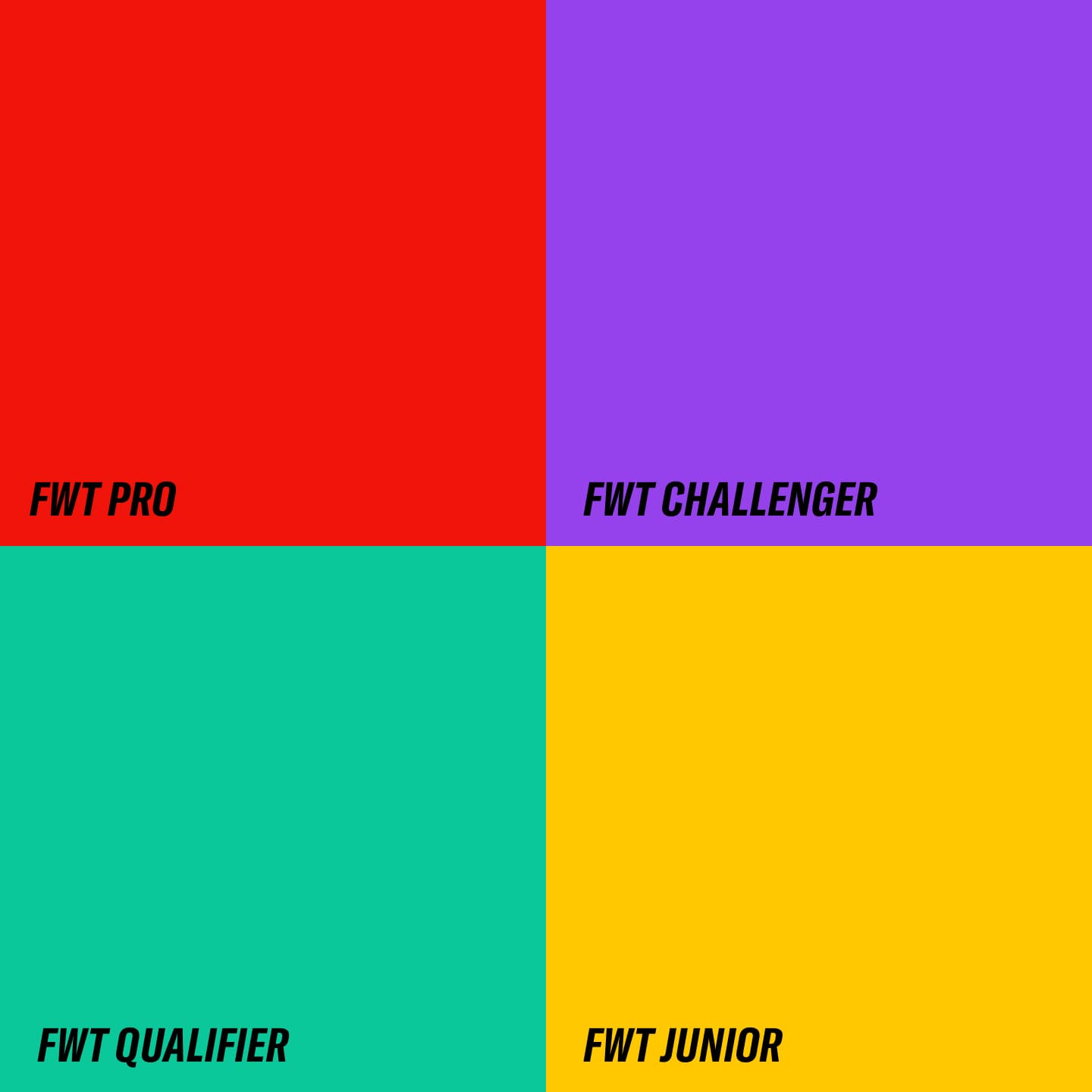
We helped the organization bring clarity to its structure by dividing competitions into four dedicated sub-sites. The brand’s visual identity was reimagined with new graphic codes for both digital and print, making the FWT brand simpler, stronger, and more engaging.
On the technology side, the site was built with a semi-static architecture using React/NextJS to minimize server load, enhanced by a global CDN to deliver fast and seamless performance anywhere in the world.
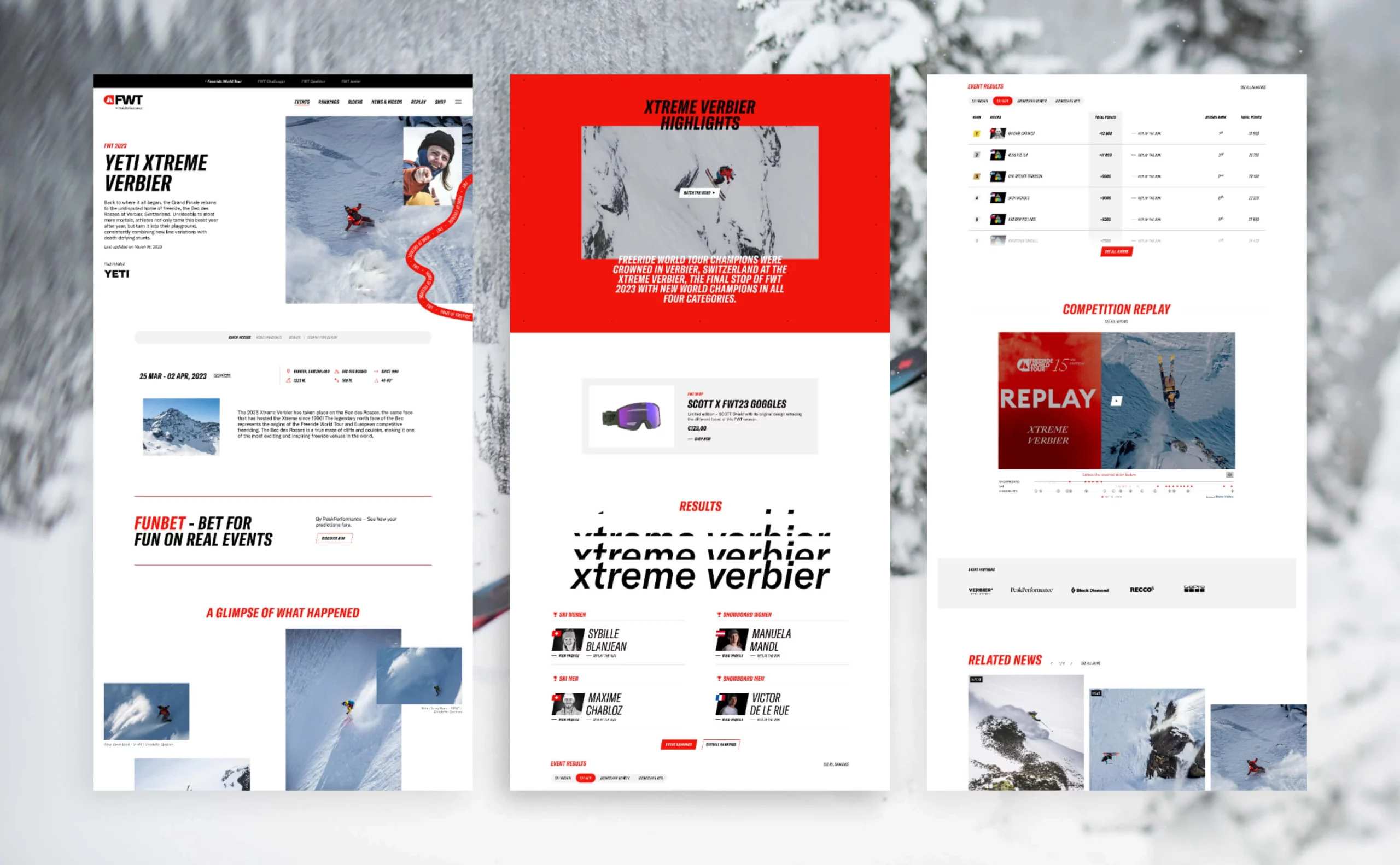
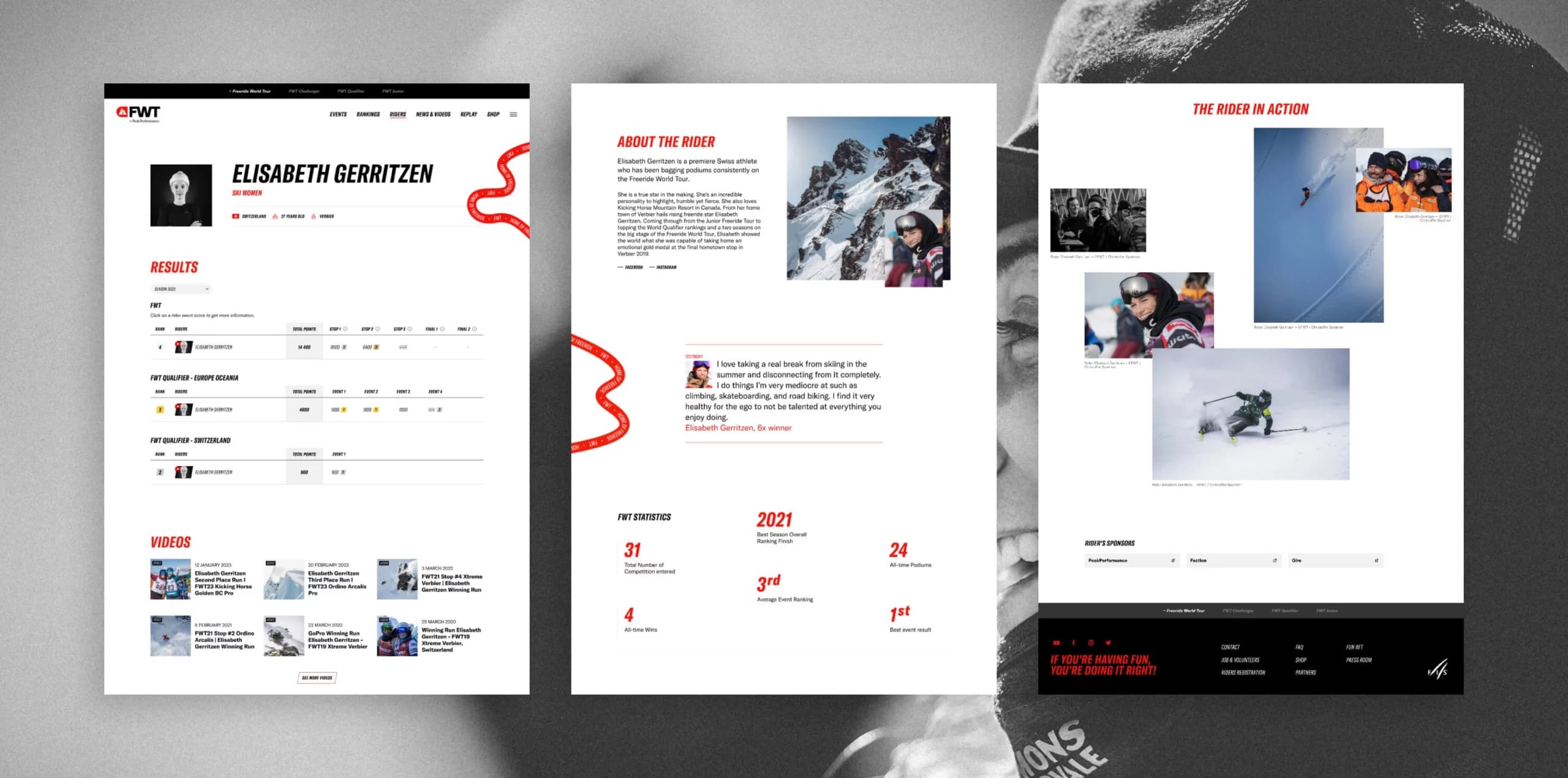
Every page of the site is designed to deepen the audience’s connection with the freeride world and its riders.
The rider profiles perfectly embody this vision, offering exclusive content that highlights unforgettable videos, insightful articles, striking imagery, and of course, each rider’s competition results.
